Table of Contents
Why did we decide to restructure the menu?So how did we decide what changes needed to be made?What did we change about the menu?- Change #1: Launch all workspace views from the menu
- Change #2: Hover over workspace view to see view type
- Change #3: Create records of all types from the menu
- Change #4: Drill into specific supporting data in the settings menu
- Change #5: Organization licensing settings now has a return button
Late last week we went live with our new navigation menu structure. So far the feedback has been positive - and keep it coming!
With this large of a change to our user experience now having gone live, let's take a minute to dive into: why we felt like we needed to change the menu, what we specifically changed, and what we're planning to roll out next.

Why did we decide to restructure the menu?
The menu in Essembi has been kept intentionally simple. We've all struggled with complex and confusing menus. This is an area where less is more. It's a fine line between KISS (Keep it Simple, Stupid) and a poor user experience. From listening to internal and external feedback, it had become clear that we needed to level up this specific area of our application.
So how did we decide what changes needed to be made?
Workspaces
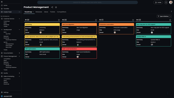
Users / Teams have access to workspaces where they can collaborate within their team and cross-functionally. Workspaces have views within them such as: Kanban boards for planning roadmap initiatives by release, Gantt charts for mapping out the timelines of sprints and epics, and grids for reporting on lists of tickets, initiatives, customers, competitors, etc. In our prior menu structure, accessing the default view in a workspace was one click away, but accessing any subsequent views took more than one click.
Data Entry
Another issue we sought to de-clickify was the entry of new data into the system. Essembi, "out of the box," stores a wide variety of data: Accounts, Competitors, Epics, Ideas, Milestones, Releases, Roadmap Initiatives, Sprints, and Tickets. It is also easy and encouraged that our users create their own user defined tables and forms to store other types of data to suite their business.

Example: In our Essembi, we have set up a custom table for tracking digital ad spend by channel for our marketing team.
Previously, it has been easy to enter data from a workspace view or drop down field that relates to that data. One of our goals was to make it much easier to enter any type of data regardless of where you currently are in the system.
Settings Confusion
One of the top pieces of feedback we have received has been users getting lost and confused in the user settings and organization licensing settings. These are important nuts-and-bolts areas of the system, but they are by no means the star of the show. What that meant to us was simple: we need to find a way to ensure these settings areas are easy to get into, but more importantly that they are easy to get out of. The fun stuff is in our powerful reporting views and data entry elements, not the settings.
What did we change about the menu?
To resolve these concerns, we have made several changes to the menu. Each one has a specific purpose in mind and our hope is that the sum of these parts creates a better user experience in the navigation of the system.
Change #1: Launch all workspace views from the menu
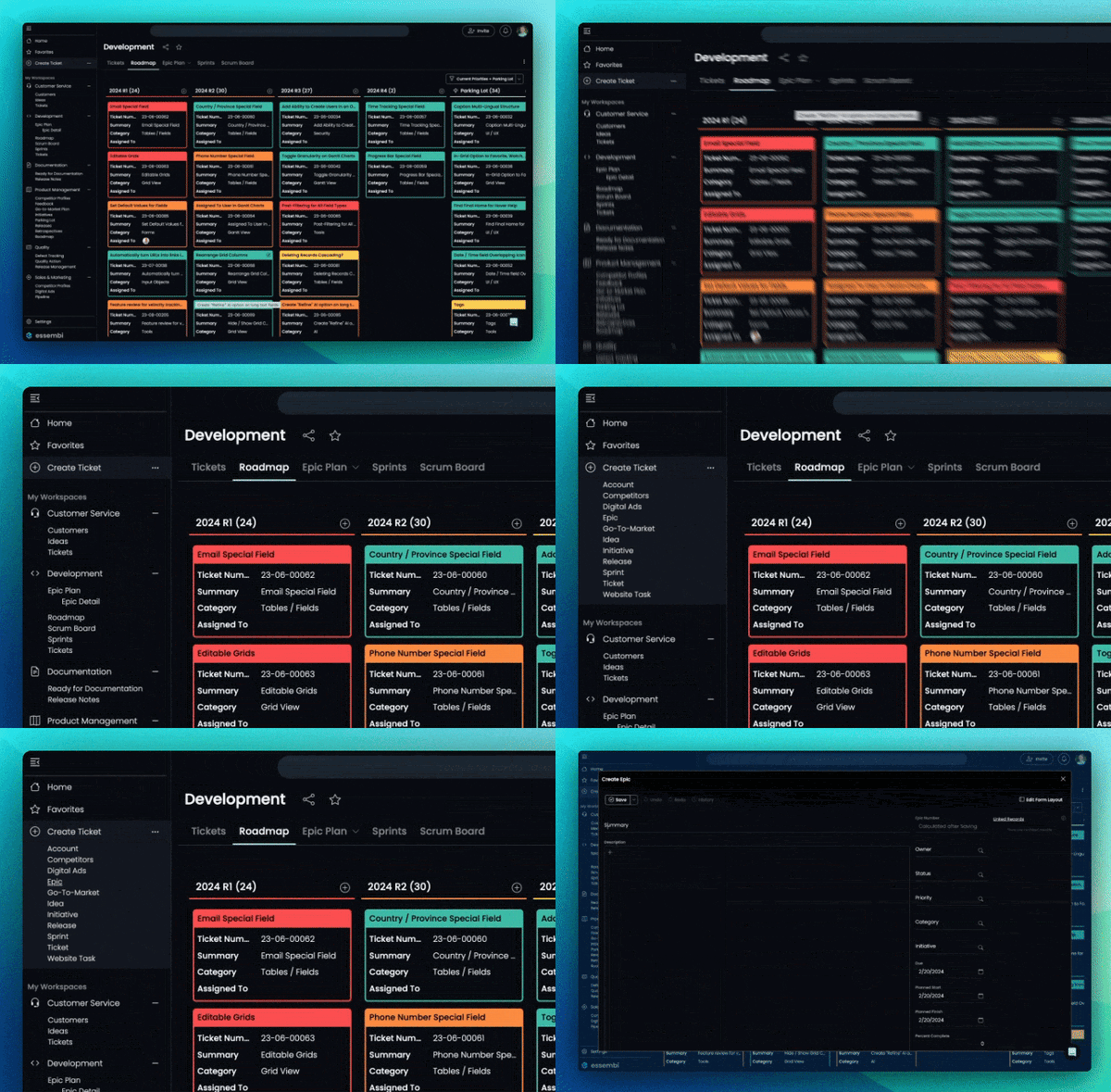
When the menu is expanded, using the hamburger stack button in the top left, all workspaces that you have access to now have their views enumerated underneath them. The workspace tree is able to be expanded and collapsed with the plus and minus buttons to the right of each workspace. By default, all workspaces are expanded, but when you collapse them the system remembers your preferences.
While having the overall menu expanded is the new default, it is still possible to collapse the menu to its slim state to maximize screen real-estate.

Change #2: Hover over workspace view to see view type
One other small UX improvement in this area is the ability to see what type of view you are going to access before clicking. It is common in Essembi to use the powerful array of workspace views to slice and dice the same data in different ways. This enhancement makes it easier for users to understand what to expect from the system when they navigate to a view in the menu.
Change #3: Create records of all types from the menu
Previously, record creation was done either from clicking the Create button on a view or by clicking the Create button on a drop down for a specific table. There is a now a Create button in the menu itself. The default type of record to create is Ticket, which is the name of a lower-level work item in Essembi. Other tables are able to be quickly accessed by clicking the more button on the right.
Note: Accounts, Competitors, Epics, Ideas, Milestones, Releases, Roadmap Initiatives, Sprints, and Tickets are included in this list by default. It is possible to add custom user-defined tables to this list with the Create Menu Type in Settings > Tables.

Change #4: Drill into specific supporting data in the settings menu
Settings > Supporting Data is an important area of the system where categorical elements such as Ticket Categories, Account Statuses, and Agile Workflows are maintained. Previously it would take two clicks to get to the user's desired maintenance area. Now this is simplified to just one click. It is still possible to create/edit supporting records through corresponding drop down fields.

Change #5: Organization licensing settings now has a return button
For Part #1 of our settings simplification, we applied a similar principal to the organization licensing management area of the system. This area is a bit more complicated, so it didn't make sense to have it open as a modal. Rather, we had this area open in a new browser tab and we made it more obvious where you are with more convenient labeling. We also added a convenient Return button that jumps you back to the home page of the Software Innovation Hub.
Change #6: User settings now opens as a modal
For Part #2 of our settings simplification, we have addressed the feedback we have received regarding the user settings area being confusing to navigate. All user settings now open in a convenient modal window, so users can update their information or change their password quickly and easily.

What else is coming down the pike?
With the navigation menu so thoroughly improved, our R&D team is moving on to other ways that we can help simplify and accelerate the development lifecycle for our users. Top of the list? Single Sign-On (SSO) with both Microsoft and Google.
That said, our roadmap is deep and we're hungry for feedback, ideas, and priorities from our user community. What would you like to see us prioritize? Let us know in the chat window in the bottom-right of our website and inside the application itself.
